As transfer landing spots settle in the next week or two, I’ll be posting a series of analyses to handicap a player’s production on his new team. There are two related methodologies I’m using to i) give a range of potential outcomes based on all similar transfers from past years, then ii) give a specific projection for a transfer based on the most similar transfer from past years. This post walks through some of the math and intuition underpinning those posts.
Method 1: Scoring Ratio
This method is blunt, focusing solely on scoring and ignoring all other counting statistics (and all the ways a player can contribute that aren’t neatly captured in traditional stats).
But the power of the scoring ratio is that we can use percentiles to summarize all of the transfers with similar profiles to develop a range of outcomes. There will always be exceptions that people cling to — Dalton Knecht being the most salient example this year — so providing a range helps anchor away from the high-end outcomes.
The methodology matches the intuition that transfer production is largely a function of where a player is coming from and what they did there. First, we
Group past transfers into scoring buckets of 3 points per game (0-3, 4-6, etc) based on their pre-transfer season
Group transfers into conference-based categories. For example, transferring from one Power 6 program to another implies a similar level of competition, while transferring from a mid-major1 to a P6 implies a different change in competition. This grouping requires us to know where a player lands, which is why the in-depth analyses must wait until the portal quiets down
Within those groups, we look at their post-transfer stats and simply calculate the scoring ratio as
Scoring Ratio = Post-Transfer Scoring / Pre-Transfer Scoring Once we’ve calculated based on past players, we can easily flip the equation to get blunt predictions for this year’s transfers:
Next Season Scoring = Last Season Scoring * Scoring RatioFor example, if a player scored 10 ppg last season and we find his scoring ratio is 0.7, then we’d expect him to score ~7 ppg this upcoming season.
This analysis is based on 2.3k transfers over the past four seasons.
Method 2: Player Comparisons
The math used to calculate the scoring ratio is simple, basically just division and sorting. The math used to calculate player comparisons is slightly more complex, but the intuition is also simple: a transfer projects to produce at similar levels as a prior transfer with a very similar statistical profile.
We can think of the player comparison as the point estimate, while the scoring ratio range gives something like a confidence interval2.
The candidates for comparison are filtered to the same conference-based categories explained above, then there are 7 stats used to calculate the most similar transfer
Minutes per game
Points per game
Rebounds per game
Assists per game
Steals per game
Blocks per game
3FG made per game
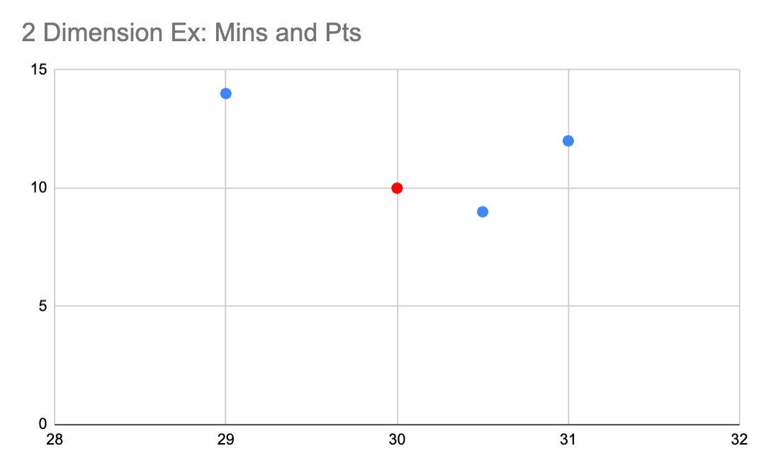
The concept for choosing the most similar transfer is simple, too. If you imagine a simple two-dimensional comparison (say, minutes and points) of all the candidates, the most similar would be the one closest to the target transfer on the grid. We can’t wrap our minds around the seven-dimensional version, but the concept is the same.
The final match gives the player who was closest overall to the transfer of interest. While other players might have more identical stats in one category, no player matched better across the board. Using more inputs also helps get closer to a player’s role or profile, like a scoring guard, a facilitator or a stretch-4, adding more definition compared the blunt scoring ratio.
Both methodologies have their deficiencies, but I hope using them in tandem — as well as qualitative scouting — can help fans, coaches and players adequately adjust their expectations for incoming transfers.
An example / tease: Zeke Mayo
With one name starting with a Z, another invoking a condiment and the jump from low mid-majors to a blue blood, Zeke Mayo is the perfect candidate to demo how the scoring ratio and player comps work. He was super productive at South Dakota State, scoring 18.8 points per game, and he’s making the leap to Kansas next year.
That slots him into the 18-21 ppg bucket and the the low mid-major to P6 group. Looking at all the previous transfers who fit that profile, we find that the scoring ratio projects a steep decline in production:
This establishes the broad range (0.53 to 0.72) of Mayo’s scoring predictions when wearing a Jayhawks jersey.
Then, using the player comparison of Jahmir Young, we can try to add some more precision on where within the range he’s likely to fall.
Young’s modest ~20% drop in scoring would still bode well for Mayo’s projections3.
While Mayo’s scoring will almost certainly decline from his leading-scorer’s numbers, even the low end of production would slot him as a contributing role player, and he has upside to be a secondary scorer for the retooled Jayhawks.
These metrics are two-thirds of the inputs into my overall transfer prognoses, so subscribe to get the full rundown on Zeke Mayo and other top transfers in the coming weeks.
Appendix: Mid-Major classifications
I split mid-majors into two broad groups since not all mid-majors conferences are created equal:
“High” mid-majors (HMM): Any conference with multiple bids in the last 5 tournaments. The American, MWC, WCC, A10 are no-brainer additions here. The MVC and OVC both qualify but feel more like the middle ground
“Low” mid-majors (LMM): Any single bid conferences
And not all mid-majors are the same level of competition. I describe how I split between “low” and “high” mid-majors” in the Appendix
However, these stats terms imply more rigor than the actual ratios and comparisons
Low case = 25th percentile
Base case = median
High case = 75th percentile


